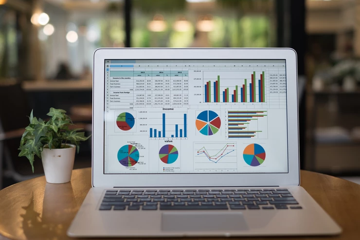
In this series we have explored Microsoft Excel from a data governance perspective, learning why Excel is not a great database. Now we turn our attention to Excel as an analytics platform and go into some of the reasons why Excel is not a great analytics platform.
Analytics in Excel are shared by copying the spreadsheet and re-sending it - When someone creates a spreadsheet with fancy charts and graphs and wants to show it to someone else there are two main ways of doing it - show it to the person on your screen, or send the spreadsheet and have that person open it and take a look. This creates several problems:
It is difficult to expand greatly on analytics without creating a "monster spreadsheet" - The progression of doing analytics in spreadsheets starts with someone looking at a chart with a few data points in a spreadsheet. That person invariably says, "hey, can we cross-correlate this data with our website data?" or "hey, can I break this down into regions and view the detail from each region?" What then happens is the original spreadsheet is now stuffed with additional data, which prompts more requests for even MORE data until the spreadsheet becomes a monstrosity that takes forever to load and analyze.
Chains of functions and cell dependencies make it hard to know what's going on in a complex spreadsheet - The progression of doing analytics in spreadsheets starts with someone looking at a chart with a few data points in a spreadsheet. That person invariably says, "hey, can we cross-correlate this data with our website data?" or "hey, can I break this down into regions and view the detail from each region?" What then happens is the original spreadsheet is now stuffed with additional data, which prompts more requests for even MORE data until the spreadsheet becomes a monstrosity that takes forever to load and analyze.
Visualization tools limited to what is provided by Excel - - Excel has some nice looking charts and graphs, but sometimes you might want a different set of visualizations, maybe for aesthetic reasons or functionality reasons. To do so you have to export the data you want out of Excel and move it into a CSV or other format that can be imported into the new visualization tool.
This is not to say that one cannot use Excel for data analysis, and indeed we explore in our next article some good use cases for Excel. But one of the biggest barriers to organizational business intelligence growth is learning to set aside monster Excel spreadsheets in favor of better data management practices.
322 North Shore Drive
Building 1B, Suite 200
Pittsburgh, PA 15212
I am interested in information on: